It’s All About the Base: Putting Your Data in Context
Published 9th Jun 2015The board of Sweet Briar College in Virginia recently announced the school will close. Sweet Briar has a long history as a women’s college in rural Virginia, and alumni, the community, and others have been disappointed and upset by the news. After all, news stories have indicated that there is more than $80 million in the school’s endowment fund.
But let’s look a little closer at that number. How do you evaluate the figure of $80 million in an endowment fund? On its face, it’s impossible to do. There is nothing inherently good or bad about that particular number. But add a few more facts (as published in the Richmond Times Dispatch and other publications), and a clearer picture begins to emerge:
– Sweet Briar’s enrollment had decreased each of the last several years and had declined by almost 10 percent over the past five years, even though some competitors were experiencing enrollment increases.
– The tuition discount at Sweet Briar has increased to 60 percent of full tuition. While some other schools have this type of discount, they typically have large endowments for funded scholarships that can keep the revenue stream intact.
– The spending rate on the endowment had increased to 9 percent, well above the 4-5 percent considered a healthy endowment draw by industry and legal standards.
– The deferred maintenance at the campus had increased to almost $30 million. High and unfunded deferred maintenance is a known risk factor for higher ed.
The trends alone indicate that Sweet Briar was in trouble, but when you combine the trends with industry comparisons and standards you get a better understanding of the directors’ decision and their judgment that the endowment was not adequate to sustain the college.
Context and trends matter
Data by itself is hard to interpret, but when data is married with trends over time and benchmarked to industry standards, it becomes much more powerful and provides more accurate insights. Looking at comparative performance data over a number of periods can help you identify patterns and the strength of those patterns. This can then help you understand the trajectory of your business, and influence predictions about its performance.
One variable to think about is what period to use for trend analysis. Trend analysis can be done from year to year, or from period to period within a year. What difference does it make? For seasonal businesses, it’s big. There are certain retailers that lose money for three quarters of the year, then make up ground and turn a profit in their fourth quarter around the holidays. Businesses that focus on tourism will have very different summer and winter results.
It may be appropriate to look at both inter- and intra-period results over time. Also, the specific years you look at can affect the trends. For example, if you start a trend analysis with 2008 as the first year, you may see unnatural patterns as a result of the Great Recession.
Visualizing Trends
Sometimes the best way to spot trends is to put the data into a graphic or visual form. For example, the two charts below show sales trends for two different products over five years. What questions would you ask about Product 1 that are different from the questions you would ask about Product 2?
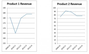
If you look at the overall trends of Product 1, you would see that the product has increased in sales overall, but clearly had a misstep in 2010/11. What caused this, and could it happen again? Answering this question would be critical if you were looking to make a significant investment in the product.
In this particular case, the company knew from internal tracking of customer inquiries that they were likely to see a downturn in sales. The management team, however, went the extra step to get comparative data, and found that competitors weren’t seeing the same trends. A deep examination of business results found that their sales methods were not as current as they should be. A change in sales methods, along with fine tuning of marketing to drive customer inquiries, has gotten the product back on track.
If you look at the overall trends of Product 2, you can see that there has been little change between years one and five, but in between there was growth. Why did it stop, and will the trend of decline from 2011 continue? Overall industry data indicates that this product is experiencing flat to declining demand – the key question now is what market share this company can hold on to. That remains to be seen.
So what’s the lesson here? Simply put, data is not enough. It has to be put in the context of trends, the competitive environment, and company actions to truly drive the best insights.
As a senior financial and operating executive, Susan Rucker brings extensive experience in helping businesses think about their strategy, operations and business opportunities. She can help businesses quickly identify the critical information needed to make the right business decisions at the right time. Susan has been an audit and consulting partner at a Big 4 firm, a senior business executive in technology and professional services firms, and currently serves as a Consultant with Powerlytics and is the CFO at the Raymond A. Mason School of Business at the College of William & Mary in Virginia.
Read next

Published 4th Jun 2015
ArchivedHow to Leverage Big Data Analytics in a Small Business Environment
Ever wonder how your business can gain a competitive advantage by using analytics and big data? Wait no more! We are hosting a free webinar entitled “Leveraging Big Data Analytics in a Small...
Read Article