
Data Visualization of Student Loan Deductions by Region, State
Published 3rd Dec 2014Data visualization is on the rise as graphics make it easier to digest the meaning behind data. Earlier today, we announced a new partnership with PolicyMap, an online data and mapping tool, which will leverage our market intelligence platform.
Instead of simply telling you about the partnership, we wanted to illustrate how Powerlytics’ data complements PolicyMap’s already extensive dataset. So, we looked at and created a visualization of one data set that is relevant for millions of millennials and other Americans- student loans.
With student loan debt weighing heavy on millions of millennials and other Americans, the findings illustrate interesting delineations across counties and states across the nation. Below we’ve included a screenshot of PolicyMap’s trademark map that visualizes U.S. characteristics of student loan interest deductions.
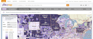
An interactive version of this map, available here, can be broken down by year, state, county, or zip code and further analyzed by percent of returns with a student loan deduction, average dollar amount of deduction, number of returns with a deduction, and total dollar amount of return deductions.
Read next

Published 19th Nov 2014
ArchivedSay Goodbye to the Guessing Game
With Powerlytics Consumer Research, you finally have Big Data analytics backed by accurate consumer financial data. Powerlytics’ consumer data covers all 154 million households/209 million adults in the U.S., and can be...
Read Article